Tuesday, 3 May 2011
Copyright information
Monday, 2 May 2011
Finished Poster


 From here we added the same backdrop we used in the magazine cover. This helped to create a common theme within the two so that people could relate it to the trailer. We used an image we took from the internet and copied and pasted it into the background. Next we switched around the layers so that it remained behind everything else such as the photograph and the text.

Finished Magazine cover

 Initially we opened up a blank canvas in Photoshop and put in a photograph of Chloe we took in a photo studio against a black backdrop. We had difficulty in choosing a photograph as there were a number that we wanted to use but we eventually settled on this one as it covered enough of the screen without having the potential to get in the way of all the titles that were going to be put there, and it also made her look vulnerable and isolated. We didn't bother to change her attire as it wasn't needed and her white outfit meant that she would stand out more against the dark backdrop. We decided on a black background as it made her look more alone and vulnerable. As well as this, darkness is seen as highlighting fear so the audience will perceive it as frightening and isolated.
 This print screen shows us starting off our magazine cover. Here you can see we've put in a background that looks like scratched glass or material under the photograph of Chloe. Initially we were toying with the idea of using just a plain background but we decided to stick with the same background as we used in the poster so that the film could be associated with a common theme that people would remember it by. On the left hand side, you can see that we have opened up the type tool which is what we used too insert all the text and here we used the title as a starting point. We had some trouble deciding on fonts, but eventually decided to use the Chiller one for the main title as it helps the audience determine the genre.
As well as this we realised the price, issue and date usually went in between the top triangle of the 'M' and so we also did this.
We once again used the text tool to put all the text in, as shown on the left hand side. We went to the odeon website to see what is currently being shown in cinema's so that we had some ideas as to what to include on the cover, and most of this can be seen on the right hand side in the section titled 'Plus'. Most of the other text is focused around our trailer as that is the main focus of the cover and helps advertise 'No Escape' to its best potential. We decided to go for a red and white theme with a black backdrop adding a black theme as well.

Magazine and Poster Planning

The image above shows the Gothika poster analysed to give me an insight into what is needed to create an effective poster that advertises a film to its full potential. whilst most posters appear very simple so that at a glance it is obvious what it is about, and gives away the genre-I have found out that facial expression, typography, colouring and in some cases-attire, is very important to giving away the main insight into the film. Gothika does this very well and manages to give out a cold isolated atmosphere which instantly helps you understand the main overall feel of the film.

Tuesday, 26 April 2011
The Editing Process
Using it last year anyway though, I knew what I was doing so it wasn't very difficult, however we faced some challengeswhen it came to cutting. Understanding that cutting at the precise fraction of a second is vital for continuity and we had to make sure we did just that. It was troublesome trying to make the cuts appear continuous and there was some argument as to how long to keep each shot as well as the exact point in which to cut. We got through it by working together, and by talking in some depth about it more time and effort was put in which gave us a better overall result.
The most challenging part of using Premiere Pro was remembering every single tool and part of the program that existed. As well as this, it wasimportant to make sure we rendered it regularly so that the quality of the trailer didn't deteriorate as we edited it.
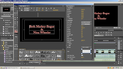
One important part of the editing process was finding the
After analysing many music pieces from a wide number of albums, these CD's were the four that stuck out as being the best for what we needed. From here we narrowed it down even more to just the single pieces we wanted to use due to their effective mixture of suspense and drama.

This is the list of effects we used too create fades in between scenes. We used the cross-dissolve tool as it created a slower dissolving effect, which made it look as though one scene faded into the next and gave for a smoother transition. To make a quicker transition we used the ‘dip to white’ tool, which made it appear more like a white flash and gave it a moderately eerie effect that helped create the atmosphere we were looking for.
 This photograph shows the fade tool in action. This is a cross fade and is slowly dissolving into the scene. We did this to open up the scene and show the transition between this scene and the previous one, especially as this scene is more of an action scene and uses a hand held camera whilst the last one has a far slower tempo. As there was bright sunshine that day also, which shows in the scene, it helps to break the audience into it more.
 We used a colour matte as we wanted a longer transition between scenes such as when Chloe or ‘Ella’ as her character is called, is having a flashback. When we tried to create a longer transition using the dissolve tools, there was no way to extend them, or add them in between scenes without a lot of extra fuss, so when we discovered colour matte, it allowed us too leave as much space as we wanted between scenes. This became increasingly useful and we found ourselves using it quite often throughout the trailer.
 As we filmed our trailer in a number of different places, we discovered we had trouble with the difference in sound volumes. For example, in filming outside-despite using the wind filter on the video camera-the background noise was a lot louder than when filming inside. As well as this, the vocals varied from place to place so we decided to adjust the volume levels. To do this, we pressed the control key and clicked on a certain point within the frame. Then we moved the lines around up and down accordingly to create the best sound effects. From here we found we had trouble matching the noise to the next scenes so we had to adjust the volume levels minutely at the end as well so that the scenes merged well.
 After adjusting the noise volumes, we still found we had troubles primarily with wind and background noises. To try and reduce the noise as much as possible we used the ‘DeCrackler’ tool and the ‘DeNoiser’ tools both circled in the above print screen. These did a good job in getting rid of the vast amount of background noise and allowed us to hear speech as opposed to lots of wind.
Overall, editing was a lot different to the preliminary exercise we did last year. Whilst that was tough, there were not nearly as many changes and touches we had to do to it in comparison to this year. Part of the reason it was so difficult was because it was filmed on two different tapes, so working out how to put them both into Premiere Pro together was quite challenging and not an easy way to start. From there, we spent hours on end going through and picking out tiny details within frames and doing the best job possible with them.
Monday, 7 March 2011
Final Filming
 d not realise just how much it would challenge me but much dedication and hard work finally paid off. Initially there was the problem of finding areas to film as my partner is in a wheelchair. This only got harder as, when it came to filming in houses, she was unable to get in and meant most of the filming was down to me. This was made harder due to the distance back and forth. As my partner couldn't carry the equipment (A tripod and a big case with the camera, microphone and batteries in it) I had to carry it daily between college and home which became hard work on top of my other books and bags. One of the biggest problems, though, was that around half way through filming the tape stopped working. Being half term, it put us a week behind in the time that we should have finished our film. Eventually it turned out that we had been given a head cleaner to film on as opposed to an actual tape and most of the recording had been on either the head cleaner or the camera, but luckily everything we recorded was there, it was just a case of using two tapes.
 ook sole charge of the camera but in this instance it was a long distance shot, and the cast had to be in the distance below the hill with the director, who h
 ad to be me, as Nina couldn't get down the hill. For Nina to operate the camera, she had to have someone with her who she could do it for her with her direction and due to strong wind that day, it meant I had to run up and down the hill to try and talk to her which became increasingly tiring and difficult, especially when it came to cueing.